One of the concepts we cover in depth in Dressed is how to identify and refine your wardrobe color palette. This is an integral part of building any capsule wardrobe.
Not only will it make sure your garments all work together, a successful color palette will also help you look and feel your best on a consistent basis. But how do you go about creating and refining your color palette, especially if you do not have access to expensive graphic design tools?
At Deer&Doe, we love to use the free website and app Coolors.co to develop our color palettes. This app not only makes it easy to create a palette (or identify your natural undertones), it also makes it easy to adjust an existing palette. Whether you want to create a new palette from scratch, or tweak one you already have, here is a step-by-step guide to creating your own perfect palette.
Visit https://coolors.co/generate and upload an inspiration photo from your mood board by clicking the small camera icon. This will allow you to select individual colors from the image you have uploaded. You can also enter your color codes in directly if you already have a palette in mind (there are more tips about this in Dressed).
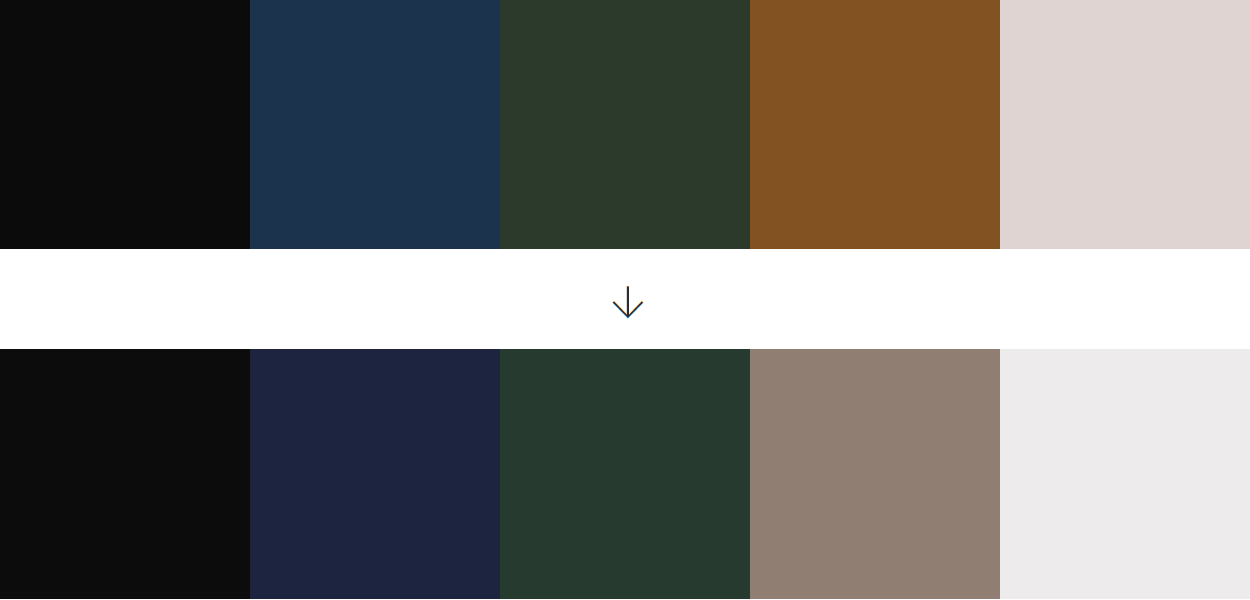
In this example, we will start with Camille’s original palette from Worksheet #3, and adjust it accordingly so we end up with her final palette in Worksheet #4. This starting palette has a weaker contrast with warm undertones. We will need to adjust it to match Camille’s cool undertones and high contrast features.

First, we will adjust the overall temperature of the palette. To do so, click the sun icon that says “Adjust Palette”.
A series of sliders will open to the right. As we turn down the temperature slider to add blue tones to these colors, we can see the before and after effect on the palette. The further you go to the left, the closer to blue these shades will become. Conversely, the further you go to the right, the more warm tones will be added. We will subtract 33 points on the cool side of the temperature scale.
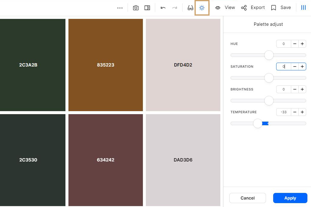
Now this palette has an overall a cooler temperature. However, some of the colors have become a little distorted in the process. What was originally an orange brown shade has become a dark mauve, which was not the original intent of the palette. To adjust individual colors, click the “View” icon and select the color you want to adjust. Then open the three dot menu and select “View more color info.”

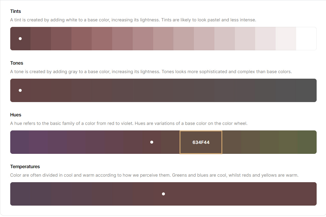
This will open a new page, and you will see a range of color options to choose from. In this case, we want to move away from pink hues and towards a color that is a truer brown. Therefore we will go to the “hue” section and select a color that is less pink.
Once you click a new color, you will see the word “Copied!”. From there, you can go back into your palette generator, click the color you want to update, and paste the new value in.

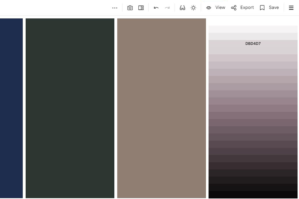
Our shade of gray also has too much pink in it. We will adjust it similarly to achieve a color that is more neutral, being careful to avoid warm undertones. If you are unsure about the undertones of a particular color, click the color and select “View Shades.” As you can see in this example, it becomes immediately apparent how much pink is in this particular shade:
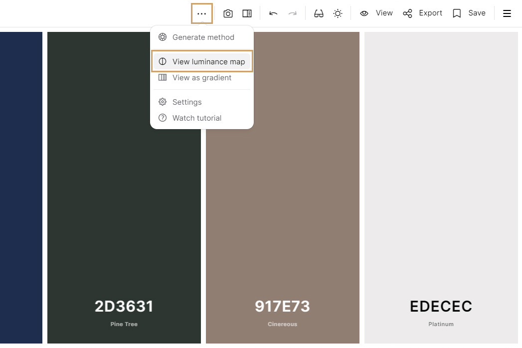
Now we will take a look at the overall contrast of the palette. An easy way to tell how much contrast is in a palette is to click the three dots in the menu and select “View Luminance Map”.
Although there is high contrast at the ends of this palette (5% to 51% to 93%), there is only a 3% difference between the blue and the green shade. In this case, because the green and blue are different hues, this is okay.
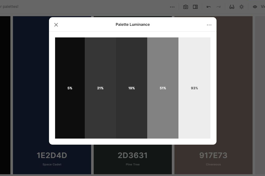
Now this palette is almost done an in harmony with Camille’s natural coloring. At this point, any small teaks come down to personal preference. The green and the blue shades are feeling a little flat, so we are going to make minor adjustments to those colors.
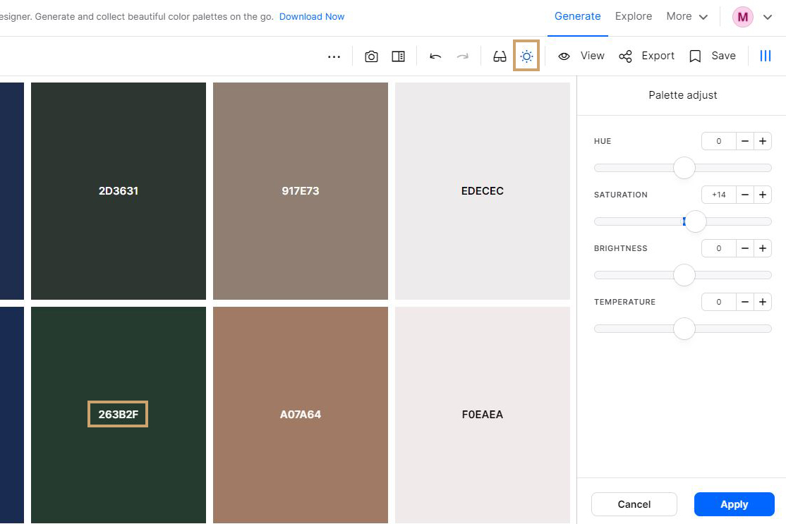
Another way to update individual colors (if you do not like the method above) is to use the palette adjustment tool. This is nice because you will see a before and after of the shades, and you can easily toggle changes by saturation, brightness, and temperature. To update only a color and not the whole palette, make note of the hex code of your new color, exit the palette adjustment tool by hitting cancel, and enter the code into the color you want to update. In this case, we are going to bump up the saturation on the green shade only.
And that is it! We have taken our mood-board inspired palette and updated it to complement Camille’s cool and high contrast coloring.